Category Archives: Art Director

VFX Producer Julia Kerguelen Nails it Big Time on Madonna’s new “Dark Ballet” Music Video

Julia Kerguelen
Art Director Julia Kerguelen shot by Lenoir Studio

If you haven’t had a chance to check out Madonna’s new music video for “Dark Ballet,” which dropped on June 6, then you are definitely missing out. The video for the song “Dark Ballet,” a single off her upcoming album, “Madame X,” pulls inspiration from French Catholic saint Joan of Arc, who’s played by African American rapper and activist Mykki Blanco in the video.

Madonna, the fourth best selling music artist in the world, is known for her ability to push the envelope and continually shock viewers with her music videos; and she does not disappoint with “Dark Ballet.” Set in a monastery, the video is symbolic of the cruel persecution of minorities at the hands of the patriarchy, with Mykki, as Joan of Arc, being jailed and burned at the stake. Madonna, who only works with the best in the industry, has a solid reputation for delivering strikingly powerful and highly cinematic music videos, and it was no different for “Dark Ballet.”

Internationally known art director and post-production supervisor Julia Kerguelen, who hails from France, is one of the key figures behind some of the video’s striking visual effects. Coming on board the music video as the post-producer in charge of VFX production, Julia, who was surrounded by an amazing team of VFX artists, oversaw the creation of many of the video’s key visual effects, such as the smoke, flying particles and flames that envelope Mykki’s body while he’s bound to the stake.

For the video, which already has upwards of 2 million views on YouTube, Julia worked through Mathematic Studio, a Paris-based animation, VFX and motion design studio that is known for other high-profile projects such as the music videos for Snoop Dog’s “So Many Pros” and Brodinski’s “Can’t Help Myself,” as well as projects for Cartier, Nike, Hennessey, Dom Perignon, Peugeot and more.

Julia, who was also the post-production supervisor on upcoming commercials for Armani and Van Cleef & Arpels, brings a pretty impressive skill set to the table so it makes perfect sense that Mathematic Studio chose her as the post-producer in charge of VFX on “Dark Ballet.”

“I think I have a good creative eye and I understand quickly where the creatives and the client want to go. Also I know exactly what we need in order to do something and I can anticipate and give advice on how to avoid tricky situations… I can check every media we receive, I can review what’s wrong in our work, etc. I know how to make tough decisions and work in a fast-paced environment and keep the pressure on myself so my team can work in good conditions and have great artistic results.”

Though Julia has undoubtedly proven herself to be an exemplary leader and skillful creator in her work as a VFX producer and post-production supervisor, she is first and foremost, an art director. Over the years she has been sought out as an art director on a slew of illustrious projects, such as Renault’s 2012 International convention of Renault business owners at the Geneva Car Show, the Airbus Pavillion at the 2015 and 2017 Paris Air Show, Valeo’s immersive exhibition at the 2016 GreenBox eXperience in Berlin, Michelin’s exhibition at the 2010 BIB Worldwide Exhibition, L’oréal’s exhibit at the 2007 International Hair Fair and many more.

Julia Kerguelen
Julia Kerguelen’s designs for Michelin

The connecting theme in much of Julia’s collective body of work is that many of the project she leads as an art director exist in the sphere of events and live shows; and there’s a reason she’s continually tapped for such high pressure projects.

She says “I used to work and prefer events because of the stage and the ‘one shot’ thing. You can’t fail, everything should be perfect ‘cause you don’t have a second chance.”

Julia’s finesse and affinity for art directing massive events stems from her early years on stage. At the age of 14 Julia began performing as a comedian on stage in a small town in the Brittany region of France where she grew up.

She recalls, “It was like a revelation to me! I felt that I had a lot to express, on stage as a dancer and a comedian. When I am on stage I cannot hide myself and I don’t need to… I can share my emotions, my stories, my colours, my way of seeing the world… I guess arts became obvious to me when I started being on stage.”

It didn’t take long before Julia relocated to the metropolitan city of Paris where she continued performing on stage as a comedian, actress and dancer; however, while in search of a more stable career, she discovered her passion for graphic design. Creating a strong foundation and reputation for herself as a graphic designer, Julia quickly moved up the ranks and was soon being called in as an art director.

“I start by analyzing the needs of the client, what is the brand, what they have to say, why they want to communicate this way or not, what are their products and what is the purpose, etc. Then when I have all this information and can see the big picture, I will write a story,” explains Julia. “Something to inject meaning, to give birth to the product as something with a soul and a purpose, to give emotions to the audience. I like to think I’m like a storyteller but with images.”

Considering Julia’s background on stage combined with her unparalleled vision when it comes to branding, she was the perfect art director to lead projects for well-known theatre company, Broadway in Paris, led by director Michael Pereira.

Michael says, “I have had the pleasure of working with Julia on a few things. She is the creator of my brand logo Broadway in Paris™. She and I collaborated on the idea and she made it come to life. I am so happy with the outcome. Later when I was searching for a project manager for my next big project, the French version of Pippin, she was the only person I wanted.”

Julia Kerguelen
Julia Kerguelen’s designs for Broadway in Paris

Knowing her history of top-notch work, Michael hired Julia to serve as the supervisor on set, art director and editor on the promo video for Broadway in Paris’s productions of  “Pippin” which use vaudevillian numbers to tell the story of a man in search of fulfillment.

“As I am very familiar with dance and I know post-production, [Michael Pereira] asked me to help him with the editing,” explains Julia. “I reached out to the cameraman, sent him some examples of framing I imagined for the edit and I tried to supervise the shooting on set to have enough material as dance is complicated to film. As I know some of the choreography it was easier for me to tell him what he should record. After that, I did the transcodes, watched all the footage and did the editing in a very short period of time.”

Julia’s personal history on stage combined with her extensive skill set as an art director, which requires her to have a comprehensive grasp over editing, graphic design, motion graphics, film editing and more, was exactly what Michael needed to create a powerful visual story on film for the company.

Michael says, “What Julia brings is an amazing global idea to this project.  I have never directed live singing and dancing for the camera before and Julia put me at ease and helped me envision angles, cuts and ideas for the camera. Also, her knowledge of movement was priceless to me.  Furthermore, when we went into the editing room her vast knowledge aided us tremendously and the result is a completely wonderful sizzle reel.”

Whether she is working as an art director or in the film and commercial world as VFX producer and post-production supervisor, Julia Kerguelen is a rare creative force who always nails her mark with innovative and seamless designs.

Julia says, “I think that because I am a dreamer I can bring some magic! I mean, there are plenty of artistic directors out there and probably better than I am but I think what makes my vision unique is the ‘vision.’ I am not here just to do some technical stuff or a beautiful image I want to create joy, hope, light, and dreams in the heart and eyes of the audience. I am a multidisciplinary artist and I’ve learned so much about the technical side that I can create everything I want. I am able to find creative solutions even with tight deadlines, short budget and high technical constraints. It’s like a giant playground to me, I know the rules, I just have to enjoy the game and make it count! ”


Advertisement

Art Director Cagri Kara Mixes Creativity and Ambition for a Winning Formula

The acclaimed Turkish art director Cagri Kara always knew his destiny lay in the arts. As a teenager, Kara wasted no time, successfully creating and selling a variety of progressive, eyecatching web designs before graduating high school. After attaining design degrees at university, the ambitious, driven Kara established himself, in short order, as one of the most skilled art directors in hometown Istanbul, the biggest, most sophisticated metropolis in eastern Europe.

The international entertainment, promotion and design communities are a tight knit pool of craftspeople and Kara’s mastery of the universal language—visuals—and impeccable reputation as a reliable, intuitive and groundbreaking artist quickly spread. Kara’s early formal accolades included numerous high-profile industry awards Crystal Apple Festival of Creativity, Kirmizi Advertising and MIXX Awards and the famed Cannes Lions Festival of Creativity. All of this notably preceded his 2016 arrival in Los Angeles, where Kara’s characteristic professional alacrity found him taking on a spectrum-spanning array of assignments and campaigns for a wide variety of agencies and clients.

One of Kara’s first, key alliances in California was with the prominent Hollywood agency Forbidden Toast, a relationship which served both as proving ground and springboard for his American career.

“I’ve been working with Forbidden Toast since I’ve moved to LA,” Kara said. “It’s a high end creative services company that focuses on entertainment art work for movies and television The company’s owner, Sherry Spencer, hired me as an art director for several projects she was working on.”

It was a significant break for Kara, and also one that demanded he deliver first rate product. “Forbidden Toast has a very high quality work standard and a clear vision for the work they produce,” Kara said. “I very much respect that and enjoy working with the team. And I enjoy the challenges of producing such great work.”

From the start, Kara’s stylish, skillful contributions fit right in.

“My responsibility with Forbidden Toast is overseeing campaigns in post-production, and ensuring the artwork is correctly executed,” he said. “The projects I worked on were highly visible and vital to the success of the films and television shows for which we developed these campaigns, and my work resulted in both increasing the company’s revenue stream and exposure in the market.”

Kara’s mixture of technical skill, instinctive flair for appealing design and comprehensive grasp on the adaptability each visual element must have is a priceless combination.

“Mainly, we do print ads, large outdoor billboards and social media campaigns,” Kara said. ”The platform is not as important as the flexibility of the art work—it needs to be effective and integrated into all types of media, both internet and large scale print campaigns.

Kara’s keen vision has created important advertising campaigns for productions by some of the biggest names in the business—Sony, HBO, Fox, Netflix, Starz, National Geographic and numerous others.

“I worked intensely with Sherry in producing the final art work for the client,” Kara said. “The art gets approved directly by the studios and, often, also by the talent. And they were all very happy with the results.”

Kara’s successful ventures include campaigns for shows with wildly disparate themes and content. He successfully worked a winning campaign for the current season of comic provocateur Bill Maher’s “Real Time” (“The show is very timely and, I feel is very important to the American political climate. It was very special to be a part of the production of the art work for this series. The art went all over the United States and the show was highly rated and successful”) preceded by one completely opposite, 2017’s launch for the National Geographic television series Genius.

“It was very exciting and challenging,” Kara said. “The talent needed to give the impression that we were actually looking at Albert Einstein. Sherry and I worked closely together to produce a successful final product that appeared not only throughout the city but also appeared on the one of the most visible billboards in the city including—the entrance of the Fox studios.”

Whether it’s documentary, fantasy, film, television, album cover art or an international promotion for FIFA giant EA Sports, Kara’s sweeping creative scale, holistic grasp of his field’s requisite elements and most effective practices create the foundational basis upon which Kara’s formidable natural skills excel—and Forbidden Toast continues to reap his bounty.

As company president Sherry Spencer said “I’ve worked closely with Cagri over the last several years—I’ve been impressed by his ability to successfully lead teams of artists and watched his creative skill and impressive talent push my company even further into creative entertainment marketing. “


Art Director Cagri Kara Always Exceeds Expectations

Art Director Cagri Kara, whose professional reputation reaches all the way from his native Istanbul to current headquarters in Hollywood, has established himself as one of the leading, most sought after talents in his field. A renown award-winning talent whose skill and professional capacity effortlessly spans a wide variety of visual platforms – posters, billboards, web, television – Kara is currently enjoying a fruitful alliance with home entertainment giant Netflix, making key contributions to promotional campaigns for their acclaimed original series.

Most recently, Cagri was key in the launch of a groundbreaking international project for the company, one where his own Turkish heritage played a critical role. Having previously executed well received campaigns for Netflix series Santa Clarita Diet and Grace and Frank, when Kara got a call from top Hollywood entertainment marketing and advertising agency Rhubarb, the results were all but inevitable. Truly in the right place at the right time and brimming with the skill to make him indispensable, the stars aligned for Kara when he was given the green light to art direct promotional efforts for an ambitious new fantasy adventure series The Protector.

“I’d worked on several campaigns with Rhubarb in the past,” Kara said. “When Andrew told me about the project I was very excited and felt very lucky to work on this Netflix project in Istanbul. They brought me on-board right away.”

Kara’s instinctive ability to command and extend the delicate co-dependence which advertising and pop culture share is reliably invaluable. This unrivaled skill has also earned him a shelf full of awards and recognitions: his groundbreaking 2015 Woman with No Voice Campaign for Polisan Cosmetics was took both the Crystal Apple Festival of Creativity’s Most Creative Use of Social Media and the Kirmizi Advertising Awards’ Best use of Medium-length Video in Social Media honors; the year prior, Kara’s boundlessly appealing Coca-Cola 50th Anniversary in Turkey Campaign won the Crystal Apple’s Best Integrated Campaign award and along the way he’s earned additional trophies from the MIXX Awards and the prestigious Cannes Lions Festival of Creativity

Significantly, Kara’s works seamlessly in any setting, always displaying with an authority, ease and understanding of his role that is internationally successful.
“It’s important to understand the culture when you work on a project from a foreign country,” Kara said. “Advertising is basically a communication channel to speak to the public. So it’s imperative that you understand people’s cultural and societal filters, especially when they look at printed media or a TV commercial for less than 15 seconds.”
For the Protector, Kara’s heritage and comprehensive mix of intuition and commanding visual design was ideal.

“There were lots of advantages to me being a Turkish art director,” Kara said. “The story is about a young man given mystical powers by a talismanic keepsake. Fighting shadowy forces, he learns about himself and his past along the way. It is the first superhero show in Turkey and it also has a lot of historical content and deep significance that would be harder for a non-Turkish person to research and understand in such a short time. The ancient history that is woven into the show is something Turkish people cherish and are very proud of.”

Kara relished the layers of societal and cultural elements the project features, and approached the project with characteristic sensitivity.

“We had many great concepts that we needed to cover in the production,” he said. “The story plays in our current period of time, and it connects modern day Istanbul to its past. It was challenging to juxtapose the ancient history of the city with a modern execution. The photographer and motion director for the campaign were very well known and had many years of experience as artists in the field, so that made things go very smoothly. Also the cast were amazing with their patience.”

“The show’s importance for Turkish culture cannot be overstated,” Kara said. “It was very exciting for me to work on something that will be seen as groundbreaking and, eventually, a part of Turkey’s entertainment culture history”.
“I’m very satisfied with the result of the production and very excited to see the campaign out in the world. There is already a lot of buzz in print and television media about it.”

Kara’s involvement and enthusiasm are second only to his elevated sense of craft and ingenuity, attributes which define both his acclaimed professional reputation and the accomplished depth of skill he brings to any project. This winning formula—which makes Kara’s presence indispensable— guarantees an ever heightening professional profile.

As the Rhubarb agency’s owner-creative director Andrew Irving said, “When Netflix asked us to help with their first original Turkish series, I immediately thought of Cagri. He flew to Istanbul to direct the marketing photo-shoot, which was shot by Tamer Yilmaz, one of Turkey’s leading fashion photographers. He played an integral role in creating the marketing campaign, and Cagri directed the cast with such finesse that the client said she didn’t know how we would have accomplished the shoot without him.”

Art Director Youjia Qian envisions visual spectacle for viral Roy Woods music video

image11
Youjia Qian

China’s Youjia Qian sees herself as a very perceptual person. She has always been extremely immersed in music and words. As an art director and stylist, she has the ability to take those things and create a visual for them. Through her work, she combines her original style with the needs and wants of those she collaborates with, turning out masterpieces over and over again.

Qian is best known for her work on a number of acclaimed music videos. These include “Devil in California” by Burna Boy, “Death Wish” by DeathbyRomy, and several hits for Gab3, including “Talking to Me” and “Hollywood Angel” featuring BEXEY. She is one of the leaders in her industry in both her home country and abroad and has no plans on slowing down.

“I think being an art director enables me to effectively communicate what I want to express in my heart and show the more profound feelings in the form of a visual. I want to present what I have seen and what I have learned and experienced through my work,” she said.

Just last year, Qian collaborated with hip hop artist Roy Woods on one of her most renowned projects to date. The music video for the artist’s hit “Say Less” has amassed over four million views on YouTube alone since its debut in November. It was issued WMG (Warner Bros Label); UBEM, Sony ATV Publishing and CAMERA and four other brands.

“Roy Woods is an artist that I truly admire. I started hearing more about him in the music industry after he signed a contract with Drake. There are so many personal emotions in his music and I also feel that I could feel something that he wants to express in his music. Many of my young friends like his music,” said Qian.

Qian was brought onto the project thanks to her good professional relationship with Gab3, who directed the video. Qian has worked on several of Gab3’s music videos, and he knew she was just the right person to help make Roy Woods’ video a hit. The teamwork between the three artists led the video to enormous success.

“It is so exciting that everybody likes our work and I also hope to collaborate with all kinds of artists again in the future. I hope to continue to reach a wide range of audiences and have my work impact many people.,” said Qian.

As the song “Say Less” is filled with emotion, Qian used that to set the tone for the entire music video. To prepare for the shoot, she spent most of her time listening to the song and all of Roy Woods’ music, to understand just what type of artist he is and what he wanted to express in the song. She decided after her research on a color tone of red. The actors in the music video are filtered by this, and it creates a specific mood that fits right in with the song. Gab3 supported her decision and worked closely with Qian during the shoot.

“We had really good communication as a team. I understood what Roy Woods wanted to express in his music, so I could create what he wanted visually, including the color and the switching of lens,” Qian described. “I like his music, which helped me to have a better understanding of his direction in the project. The people that I worked with on this project were great and I felt very comfortable with, which made the work that much more enjoyable.”

Check out the video for “Say Less” and admire Qian’s outstanding work.


Written by Annabelle Lee

Graphic Designer Laura Suuronen’s Flair for Arresting Visuals

Graphic designer Laura Suuronen’s command of virtually every conceivable visual format—designing everything from billboards and logos to web sites and product packaging—has established her as one of the preeminent leaders in her field. Suuronen’s gift for delivering a final product which surpasses her client’s original expectations is a skill that’s earned her an international reputation of significant renown.

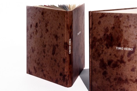
She has a particular affinity for projects from the world of art and publishing—sophisticated platforms where her impeccable visual style and deep well of skill and instinct really come into play and one of Suuronen’s most striking achievements was her design of a monograph on famed artist Timo Heino for a retrospective exhibition at the Helsinki Art Museum.

“Timo Heino was represented by Galerie Anhava, the leading contemporary art gallery in Finland, who is a client of mine,” Suuronen said. “I’d seen his installation ‘Addiction’ when it was exhibited there, but otherwise I wasn’t familiar with his work. I’d already designed the 20th anniversary book for Anhava, and when Heino asked the gallery directors for recommendations on designers to do the catalog for his retrospective at the Helsinki Art Museum, they dropped my name.”

laura-book-4

This was no simple task. Heino is an acclaimed artist with a distinct approach that frequently emphasizes a striking juxtaposition of man-made and organic substances, and Suuronen relished the chance to complement his visual style. The project required her to bring all of her creative techniques to the table—art direction, graphic design, typography, photo editing, layout design—and the book she produced was a stunning example of Suuronen’s versatile design genus.

She managed every aspect of the challenging task from the top down, and typically, expanded her role to also create a visual identity for both the exhibition and its promotional materials.  “I created the entire book,” Suuronen said. “The client only provided me text files and photographs. I art directed and designed the whole thing book from the format, materials and photo editing on up. I decided the size and shape of the book, how it’s bound, selected the papers. I chose the typefaces, designed the typography, selected the images, and conceived the structure of the book, its rhythm, its pace, and further highlighted that by the use of different paper stocks.”

laura-book-spine

From there, Suuronen went directly to the source to finalize the project. The whole process was pretty informal and most of what I presented got approved straight away, from the structure and layout style to paper stocks,” Suuronen said. “For the cover I offered several options, and they chose the one which best fit Heino’s work—we made it into a curious object, a hard cover book complete with soft, squishy cover boards. Seriously, who makes a book to be like an egg?”

Upon publication, Suuronen’s eye-catching mixture of elegance and eccentricity quickly earned significant notice. The monograph was recognized as a Beautiful Book by the prestigious Finnish Book Art Committee’s annual Most Beautiful Books competition and also by the Finnish Art Society with an honorable mention in its Literature Awards category. The Book Art Committee described Suuronen’s work with particular enthusiasm: “What is this? Human skin, animal hide, marble? The cover of this book casts the reader straight into the physical nature of contemporary art: grab, squeeze, open. Anyone who dares to venture into this book is rewarded with a fine introduction to the artist´s works and a pleasant reading experience. The difference between the natural-yellow of the text pages and the chalk-white paper of the photo pages, the calm and well-paced layout and the modern typeface all deserve due thanks.”

laura-at-work

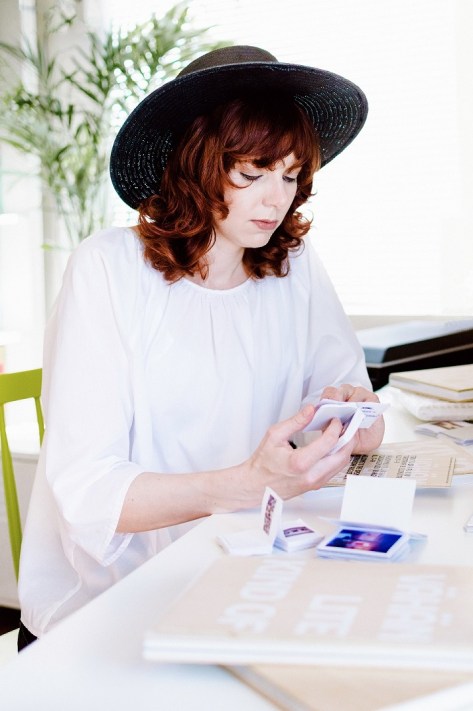
Typical of Suuronen’s intuitive style, the book’s design itself reveal as great a depth of insight to the subject as the text and illustrations. “The book presents an experience similar to viewing Heino’s work in a museum setting, but with deeper insight into the artist’s philosophy and approach,” Suuronen said. “The text pages are printed in black only on uncoated cream-colored paper, while the projects are presented in full color on bright white, coated pages. The differences in paper stock not only create rhythm and pace into the flow of the book, but also make each section better functioning: the text sections are easier to read from the off-white, and the artworks are better reproduced on the coated paper. There’s also a few underlying narratives that run hidden throughout the book, should a reader really commit to the experience… there’s different levels in it.”

This is key to Suuronen’s constantly expanding international profile—her innate ability to enhance and elevate a project to the point where it assumes an even greater impact and significance for its audience. As the esteemed American designer Vanessa B. Dewey, formerly Mattel’s Lead in Creative and Development Experience and current LA Design Festival Board of Directors member, said, “I’ve been a fan of Laura’s work for some time—it is a fresh voice that stands out from current design. It possesses a refreshing elegance that catches your eye and pulls you in. While exploring, you’ll discover thoughtfully designed books with brilliantly sophisticated type to vibrant sculptural branding or poster design. Overall, it’s intelligent, simply brilliant design that’s never forced.”

The Los Angeles based Suuronen’s professional recognition steadily grows with each project, making her one of the most in-demand graphic designers anywhere—so much so that her current, very high-profile work load is subject to client mandated non-disclosure agreements. But, with her distinctive flair for arresting visuals, you’ll know it when you see it.

“I’d designed books and record covers before,” Suuronen said. “And these are the most permanent and culturally relevant mediums in the field of graphic design. I actually prefer making things that stand the test of time, as opposed to short lived, more commercial projects. I’m not interested in adding to the noise and clutter, but seek to create work that connects with people. I do love what we ended up with—I live for this stuff.”

Art Director Cman Wong works with award-winning film composer on captivating video

image1
Cman Wong

Always interested in all things art and design, Cman Wong was, in a way, destined to be an art director. Although she did not always expect to express her passions in the form of advertising, she found it a way to explore her creativity in a way she never thought possible. When creating dynamic visuals for the world’s largest brands, she feels a thrill.

“It’s a fancy job title with the responsibility beyond the job title. As an Art Director, you’re basically responsible for all visual elements of a product or campaign, from the presentation deck to the overall look and feel. You have to provide a visual direction that not only is eye catching, but also relates to your target audience and divert the message through it,” said Cman.

As an in-demand Art Director, Cman is consistently impressive. She has worked on projects for Marvel, Ferrari, and Undercover to name a few. She is always stimulated by her work and finds that although it may seem like she simply works in marketing, she is truly an artist.

Cman has also had the opportunity to work with acclaimed artists and filmmakers throughout her career. In December of 2016, the Art Director collaborated with Tan Dun, an Academy Award and BAFTA Award winning film composer and conductor. This experience was one of Cman’s highlights of her career.

“It was such a great honor to collaborate with such a prestigious composer like Tan Dun. It is one of my favorite experiences in my career and my life as a whole. Cross discipline collaboration has expanded the possibility and audiences of my work. It was another example to prove the boundless and flexible art I could make,” said Cman.

The project in question was that of the Modern Media National Spirit Achievers Awards 2016. The National Spirit Achievers Awards was first issued in 2007. It is a pioneering work of the Modern Communication Group to carry out “Everything Monthly” sincerity for the eternal moments of the times. It aims to recognize Chinese leaders who have achieved excellence in various fields and created an era. Eighty-one creators, including IM Pei, Fan Jin-shi, Xu Bing, Tan Dun, Ye Jintian, Zhang Yimou, Mao Yuchen, Zhang Xiaogang, Zeng Fanzhi, Ding Lei, Jia Zhangke, Chen Qigang, Huang Yongsong, and Lang Lang, were honored with awards in fields such as art, music, film, architecture, business, education and more. Nowadays, the National Spirit Achievers Awards has become an award with outstanding influence. Each awards ceremony has also become a glorious moment for elite leaders from all walks of life to meet.

For the ceremony, Cman provided the art direction on the video content for the main performance, setting the overall artistic style and visual image. In doing so, she developed key frame content that transformed the audience’s experience, adding another level of entertainment and layer of enjoyment to the performance. Rather than simply listening to the music, they had a visual spectacle created by an artist like Cman.

The video visualized the rhythm of the music in a poetic way. It was inspired by the music and culture of Tibet and Chinese traditional performance. In the breathtaking opening scene, dust begins moving, followed by a cinematic Chinese opera theme form in the 13th century during the Song Dynasty and digital ink Chinese painting scene. It reformed the best image of traditional Chinese Art in a modern way.

The response for the video was tremendous, and Cman personally received not only great feedback from the client, but also the audience who were completely immersed in her creation.

“I like it most because it’s a live performance to see the actual reaction and feedback from the audiences. It’s such a great lesson and inspiration to work at such a high level of international standard performance,” she concluded.


Written by Annabelle Lee

Art Director Phenix Miao helps raise thousands for Itron Battery Crowdfunding

Not many children can grasp the understanding of color and architecture the way China’s Phenix Miao could. At a young age, he was quickly able to spot the small details in furniture and props in daily life. It was a hobby and skill that he quickly realized could transition into a career. Working as a successful Production Designer and Art Director, Miao is now a leader of the industry in China.

Throughout his career, Miao has shown what a dynamic Art Director he is. With his work on films such as Shanghai Sojourner and Lottery, Miao’s attention to detail and vast talent is evident. He also lends his skills to commercial work, recently creating a series of promotional videos for Lepow and another for Itron Battery to promote their crowdfunding. With an outstanding number of viewers online, the Itron Battery commercial is one of his greatest successes in his esteemed career.

“Phenix is a very rare talent with both marketing and artistic sense. We worked closely on the Itron commercial, talking a lot about budget and production. Phenix was vital for the success of the commercial, and even found the location at a very affordable price, which helped the feeling of the film. He helped me to balance the art and budget so well. He is an expert when controlling the costs of everything. Phenix understands the difference between marketing value and artistic value, and he understands people. From his angle and visual aspect, he did a great job making the crowdfunding video look appealing. A crowdfunding commercial should be tangible and amiable, not chasing perfect as a normal TV commercial would. Phenix told me that crowdfunding is not charity, you need to let people feel this is a hopeful product and company. This outlook inspired the team. His outstanding communication skills allowed everyone to clearly understand what we were doing. He is a great leader and creator,” said Alice Fan, Producer.

The Itron Battery commercial advertises the company’s portable battery bank, the world’s fastest portable charger. It completely charges in 18 minutes, and within three minutes, one phone can be charged. The commercial showcases the product while still being comical and informative. It features two leading characters, one explaining the charger, and another looking to purchase one. They run through many different scenarios in which one may need a charger, leaving viewers both entertained and in need of the product.

“All the people that worked on this commercial were so professional. We did our work really fast, because we were so familiar with each other. From scene to scene, people just did everything very naturally. There was such chemistry, everything was as natural as breathing,” said Miao.

This commercial was not Miao’s first experience with a crowdfunding style video. He previously helped to raise $217,501 USD for Pivot Turingsense crowdfunding, achieving 274% of their goal, and for HiSmart crowdfunding, they reached 531% funded after raising $297,106, with the videos being the main source of awareness. That being said, the Itron commercial was by far the most successful, with hundreds of thousands of views online and reaching 706% of their goal by raising $289,472. It was also an Official Selection at the 2016 International Peace & Film Festival in Orlando, Florida.

“I still feel really excited about this commercial. When I hear so many people talk about it, I almost want to run up and interrupt them to let them know that I worked on it. That’s how proud of it I am. It is a big success in three aspects: art, commercial and crowdfunding,” he said.

Miao and the Director of the shoot, Peter “Zhen” Pan, had known each other for ten years when the opportunity to work on the commercial arrived. Miao is the director’s go-to art director and was the first person he reached out to. After reading the script, Miao accepted right away.

“Peter and I are golden partners. He knows I am a great Art Director that is full of ideas and the perfect match for what he wants. He just called me and told me the details about this project and we started working on it that same night. He always gives me enough space and time to design and develop my ideas. He fully respects me,” said Miao.

As the Art Director, Miao was in charge of the overall look for the commercial, selecting the best and most suitable artistic elements while leading the creative team. He designed a concise, natural, and clean aesthetic while controlling the style. He understands the difference between market value and artistic value, setting him apart from his colleagues. For this Itron commercial, he designed the color tone with Pan and knew to keep in mind the difference between a regular commercial and a crowdfunding commercial. He made sure to meet the requirements while planning the artistic elements around the brand, creating a higher brand value for the video. This allowed the product to stick in customers’ minds.

What was perhaps Miao’s most considerable contribution to the commercial, however, was finding the location of Elliston Winery. Miao enjoys working in historical settings, and the winery is no different. When decorating a historical set, Miao plays with the flavor that they bring to the table and plans everything around the atmosphere they possess. His passion for the location was passed onto the entire cast and crew. They treated it like their homes, making sure to respect every piece of furniture and brick in the building. Such respect for his setting and its parts is a main reason Miao is such a formidable artist and leader.

“I have been Phenix’s Assistant for years, but I also see him as my guide in my film career. He is not only in charge of the art department but is also a tremendous team leader. He understands style and perfectly controls the appearance of every image. Phenix is a great mentor and teaches me all of his techniques and knowledge. He is a talent but also very easy going. Phenix always knows how to take a director’s idea and turn it into something special. He knows how to make the effects suitable and always has new, practical ideas that come from his plethora of experience. I think the fact that he has also worked as a director and writer allow him to understand the role of the art director even better, and it sets him apart from the rest,” said Qin Zheng.

Watch the Itron Crowdfunding commercial here.


Photo taken by Peak City International Film Festival, Phenix Miao and John Whitaker

By Sean Desouza

Art Director Hanna Petersson brings unique touch to packaging

Hanna Petersson is not like other art directors. She is constantly adapting, looking for a new challenge with each new day. Her style is influenced by her Swedish heritage. Scandinavian design is very scaled back, simplistic and focuses on form and function together rather than just putting things into a design solely as decoration. For Petersson, each part of a design must have a purpose, and if it does not, she knows exactly how to give it one. That is what makes her such an outstanding talent, and why she is known internationally for what she does.

At just 23, Petersson has put her artistic touch on some of the world’s largest brands. She has collaborated with many teams, creating imagery and customer engagement for Samsung, Swedish Match, and more. Her artwork captivates, and her individual exhibition at the House of Culture in central Stockholm garnered a lot of attention and earned her quite the fan base. She uses illustrations to tell a story, and uses her talent to help many brands increase sales.

“As an art director, it is incredibly important to research the client and the target audience and to create content based off of this that is rooted in facts and human truths. A design can look amazing, but unless that design is perfectly suited to the client and target audience the design is useless. What I need to make sure is that I always do my homework on whatever project I may work on, that I am passionate about it, and that I make sure that every detail is perfect before going into the physical production of the idea. The art director comes up with an idea and is in charge of directing it all the way from idea to finalized product. It is a great responsibility and a big challenge, but also incredibly rewarding and interesting to work on,” Petersson described.

Having worked with reputable retail agencies like WorkShop and Grey, Petersson also recently worked with AdPlant. With the company, she worked on a variety of projects to create visual development and branding for big companies, which will be released next year.  Although the official projects can’t be mentioned for this reason, Petersson’s work with the company astounded all she worked with.

“Hanna is an excellent creative talent. I’ve had the pleasure of working with Hanna as both an illustrator and a communication creative for AdPlant network. She is a quick, smart person who pays attention to details in her handicraft. She is a warm and kind person who will ‘run that extra mile’ to deliver pitch perfect creative work,” said Marcus Enström, Founder of AdPlant and Lead Creative.

Petersson’s work greatly impressed AdPlant’s client. Despite not yet being released, the project she worked on has already had a lot of success, and the client is looking to have similar projects follow this one. They know it will be a hit, and they want to work with Petersson and AdPlant again after such a successful collaboration. The product category is one of the most sold in Sweden, and the designs Petersson has produced are one of a kind. They will undoubtedly increase sales and attract new customers to try the product. Petersson knew exactly how to please the company and potential customers at the same time, which is quite the challenge for many art directors.

To do this, she first had to identify exactly what was needed. In this case, it was a series of packaging designs with a unique set of illustrations that she would produce. She then needed to create a new set of color combinations to be used that would not only communicate the right feeling, but also easily convey what the product is and what it stands for. According to Petersson, designing a series of new products within the same category means that they must all be similar to each other and feel like a series, but they need to stand out from each other and be the most unique at the same time. Finding that balance takes some time and a lot of work goes into just coming up with an extraordinary amount of different variations and suggestions that then will be used to decide exactly what the finished product should look like. The process took Petersson quite a long time, because the client wanted to make sure that they were a part of the process every step of the way and got their say in the final product. As Petersson is known for her excellent communication skills, this was not a problem, and she knew exactly what they wanted before they even had to say it.

“This was a blast to work on because I really got to improve a design style I had dipped my toes in not too long before. What was also great was that I knew that these designs would be seen by hundreds of thousands of people in their everyday lives and that my work would be one of the main reasons for the success of the products,” said Petersson.

After seeing Petersson’s previous designs, Enström approached the art director knowing she would be a necessity for the success of his upcoming project. Petersson had previously done a project where she designed and sold apparel through her own shop. These designs were unique, and the founder of AdPlant later found the project in an online shop and asked her if she was interested in working on a project using a similar style of design. Despite working on other projects at the time, Petersson said yes to AdPlant. She was immediately interested in working on the project when she heard about it, and wanted to work on a packaging design project that would be a vital part in the sales of a company. She knew she would be able to influence what the design of the product category could look like and innovate the category from what it was at the time.

“It was very nice to hear that a company was interested in my designs and talents and therefore I was very happy to work on the project from the start since I knew that they wanted me specifically and therefore trusted my opinions, which let me have more freedom in my work and to really push the designs further,” said Petersson. “That I got this responsibility was a great honor and it really allowed me to trust more in myself and my skills. Not only was this a great project from an art perspective, but also from a work experience perspective as I got to communicate with a very large, international company and that they got to see my work directly,” she concluded.

Petersson’s advertising experience and her natural artistic talents make her the perfect art director. She will undoubtedly continue bringing success to anything she works on, and is definitely one to watch.

Art Director Ji Young is vital to success of new film ‘The Sacred Mushroom Edition’

“There are few films that show how much the art department pays attention to details. In the film Room, the art department team studied the sun’s movement and bleached the part of the wall where the sunlight comes through the shed’s skylight and hits. They believed most of the objects inside the room should have some sort of stories because the five-year-old main character personifies every object. In Danish Girl, the set starts with the gloomy grey bedroom in Copenhagen where the main character couldn’t find his real identity, and then it shifts to a colorful room with beautiful floral pattern wall and Art Nouveau style architecture in Paris where he finds his real identity as a woman and starts blooming. I love art directors who are storytellers, who transfer the words into imagery by conceptualizing, using imagination, and creating the mood with emotion, style, and feeling,” said Young.

When Ji Young Lee talks about what it is to be an art director, one immediately understands that this is someone who not only loves what they do, but someone who appreciates every intricacy of their craft so fully that their passion and commitment are unrivaled. Young wanted to be an art director because she wanted to create a world that affects people who are watching the film; she thought it was fascinating that she could make the background world that helps people believe the story, whether it is real or fantasy. This is exactly what she does, and this vision is evident on every film that features her name in its credits. Director Ryan Betshart says without Young, he would not have the success he does today.

“Ji was my art director for two projects, the first being Paper Chase, a music video that has played Ann Arbor Film festival, which was a highlight of my career. Ji did so well and was so exciting and thoughtful to work with that I hired her for my next short film The Sacred Mushroom Edition,” said Betshart. “Working with Ji helped my career so much so that I intend on hiring her again on all my future projects. Her attention to detail is second to none – no one has an eye for set design like her – meticulous yet on budget and fast, a true professional. Her communication with the other departments, as well as with her own crew is clear and effective in ways I have rarely seen on set. Things get done, and so quickly and quietly one would think magic was being used to make everything perfect. Does this make Ji a magician? Does she have magical powers like a sorcerer? I’d say yes. Everyone on set respects her. The actors love her. She is the first to show up and the last to leave. I wish I had met her sooner, my previous films would all have done much better!”

Such accolades, although flattering, are not what keeps Young going. For her, it is all about her work. The Sacred Mushroom Edition is at the beginning of its festival route, and has already seen tremendous success. It premiered at Portland Underground Film Festival on April 9, followed by the prestigious Mammoth Lakes Film Festival on May 25, the Moviate Underground Film Festival in Pennsylvania on May 28, and internationally at Winnipeg Underground Film Festival in Canada on June 1. None of this could have been possible without Young’s artistic eye, and yet, she remains humble.

“It feels very surreal and exciting to have the film be doing so well. I don’t know much about experimental films, so I had no idea what kind of films our film was going to get chosen with for the festival. I’m just very glad that now I got some experiences in experimental film, which was the world that I never got to explore before and got these great festival opportunities by working with my great friends,” said Young.

The Sacred Mushroom Edition is an ode to the 1978 version of Kenneth Anger’s film Inauguration of the Pleasure Dome and its peculiar use of Electric Light Orchestra’s album ‘El Dorado’ over images of a ritual orgy between gods. The Sacred Mushroom Edition finds two fallen angels arguing over ELO and their lead singer Jeff Lynne’s affiliated super group The Traveling Wilburys – and his connection to the dark side.

“I watched the original film and loved how stylized the set design was. It was visually stunning and very artistic. Most of the films I’ve worked on wanted the art department team to stick to what’s exactly written in the script in terms of creating the set, but Ryan loved to hear about team members’ interpretation on the script and discuss with them which sometimes led to something unexpected. This film helped me to use more imagination and understand sometimes the filmmaking is less about form or content than it is about context,” said Young.

Although Paper Chase was a music video that focused on more digital manipulation of the video with a minimum set, The Sacred Mushroom Edition was the exact opposite. The film required two different sets, with strong contrasts between the two. The film starts in a backyard, and then it transitions into a darkroom. For the backyard, Young made some colorful choices for the set dressing, because she wanted to create brightness and lightness. For the dark room, she wanted to create some intimate, gruesome and cluttered environment, and therefore put different materials and furniture that had great textures for the set dressing.

“As this film is an experimental film, what it says is very abstract and poetic. The good part is it’s very artistic and unique film, but it could be difficult to understand for the audiences who used to watch the traditional narrative films. Therefore, my job was to provide some sort of device that would allow the audience to connect themselves with the film, so they don’t feel total alienation,” said Young.

There is little doubt as to why Young is considered one of Korea’s best recent art directors, and even less doubt that we will continue to see her name attached to many high-profile l films for years to come.

Art Director/Motion Graphics Designer Ilya Tselyutin’s Innovative 3D Revolution

Art Director/Motion Graphics Designer Ilya Tselyutin specializes in a field of media technology so advanced that it almost seems he’s straddling a unique cusp between day to day creative facts and out of this world science fiction. Already recognized as a master in his field—a fast moving discipline that combines graphic design and animation in motion picture title sequences and television commercials—Tselyutin also excels in the exotic field of spatial augmented reality.

“This is also known as projection mapping, video mapping and 3D mapping,” Tselyutin said. “One of the earliest public displays of projections onto 3D objects was Disneyland’s Haunted Mansion ride back in 1969, but it wasn’t until the early 2000’s, when more advanced tools and software became available, that artists began using projection mapping in artwork.”

“It is a special technology used to display moving objects on various surface as a video projection, so, for instance, an entire building can be turned into a multimedia installation and become a part of a compelling story.”

The California based Tselyutin’s singular palette of skills, both as a creative artist and technical innovator, made him particularly well suited to explore this territory, a long-standing interest which he first he became involved with as a university student back in his native Russia. His fascination with 3D graphics, animation and design coincided with formal training in computer science and provided an ideal confluence for opportunity when the technology first arrived in the country in 2009.

“I was working at Channel One Russia as a broadcast designer,” Tselyutin said. “I was constantly exploring other areas of 3D motion graphics and the ways it can be implemented. And when I heard the Radugadesign agency was looking for 3D professionals to work on something that was quite new and challenging I was eager to try it.”

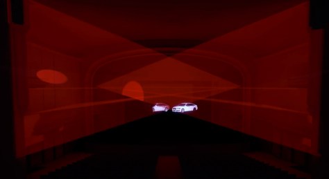
Audi-3.jpgAudi-2.jpgThe Moscow agency was the perfect new professional home for the talented, ambitious Tselyutin, and he quickly distinguished himself in the vital new field. “I saw great potential in this and left my job at the TV channel to focus solely on 3D mapping and augmented reality,” he said. “And 3D mapping technology was unheard of in Russia when we created the first car projection show for Audi in the country.”

Created for the 2011 Audi Car Design Awards the spot featured graphics that changed the colors and tires of a 3D car model and established Tselyutin as a fast-rising 3D sensation (see it here). “I took part in all of the 3D mapping projects while working at Radugadesign,” Tselyutin said. “We worked on commercial projection shows for such clients as Audi, Samsung, some national mobile operators and many others.”

 Tselyutin’s dedication and groundbreaking achievements benefitted everyone involved. “Working with Ilya was always a very pleasant experience,” Ivan Nefedkin, Radugadesign founder-CEO, said. “He was one of very few professionals in Russia who completely understood the specifics of 3D augmented reality. There was no really a university degree for what we did, so there were only a few people who could do the job. He always went extra mile to support our team by overtaking the hardest tasks to make sure the project is delivered on time—on the Audi projection show, he would stay up working all night. Ilya played a critical role in establishing Radugadesign as one of the country’s leading media agencies.”

Tselyutin’s professional reputation as an innovator and visionary quickly spread throughout the international media world. “Right after we produced that first car projection show, many agencies in Russia and abroad started implementing the same technology,” Tselyutin said. “I was invited to produce a projection show by the National Institute of Technology Kartanaka, Mangalore, India, who were quite impressed by what we were doing in Russia. I began receiving many offers from all over the world, and decided to move abroad.”

Currently residing in Hollywood, where he serves as Art Director/Motion Graphics Designer at the prestigious Trioka agency, Tselyutin is still breaking new ground, always expanding and elevating his technique. “Working on those challenging projects helped me master a great variety of new skills,” he said. “The most important knowledge I gained was learning how to successfully generate dynamic visual effects on static footage for a completely immersive effect. This proved to be very useful later on in my career,

Taken with an already impressive roster of achievements, the influential Tselyutin’s future potential is limitless.

“Ilya has a unique set of skills,” Nefedkin said. “From the advanced technical knowledge he acquired studying computer programming to his outstanding graphic design skills—he always came up with new creative ideas, challenged himself and the whole team, and pushed the boundaries of what was possible. Our clients loved it. He never ceased to amaze us with his both creative mindset and perfect technical execution.”