
Graphic designer Laura Suuronen’s command of virtually every conceivable visual format—designing everything from billboards and logos to web sites and product packaging—has established her as one of the preeminent leaders in her field. Suuronen’s gift for delivering a final product which surpasses her client’s original expectations is a skill that’s earned her an international reputation of significant renown.
She has a particular affinity for projects from the world of art and publishing—sophisticated platforms where her impeccable visual style and deep well of skill and instinct really come into play and one of Suuronen’s most striking achievements was her design of a monograph on famed artist Timo Heino for a retrospective exhibition at the Helsinki Art Museum.
“Timo Heino was represented by Galerie Anhava, the leading contemporary art gallery in Finland, who is a client of mine,” Suuronen said. “I’d seen his installation ‘Addiction’ when it was exhibited there, but otherwise I wasn’t familiar with his work. I’d already designed the 20th anniversary book for Anhava, and when Heino asked the gallery directors for recommendations on designers to do the catalog for his retrospective at the Helsinki Art Museum, they dropped my name.”

This was no simple task. Heino is an acclaimed artist with a distinct approach that frequently emphasizes a striking juxtaposition of man-made and organic substances, and Suuronen relished the chance to complement his visual style. The project required her to bring all of her creative techniques to the table—art direction, graphic design, typography, photo editing, layout design—and the book she produced was a stunning example of Suuronen’s versatile design genus.
She managed every aspect of the challenging task from the top down, and typically, expanded her role to also create a visual identity for both the exhibition and its promotional materials. “I created the entire book,” Suuronen said. “The client only provided me text files and photographs. I art directed and designed the whole thing book from the format, materials and photo editing on up. I decided the size and shape of the book, how it’s bound, selected the papers. I chose the typefaces, designed the typography, selected the images, and conceived the structure of the book, its rhythm, its pace, and further highlighted that by the use of different paper stocks.”
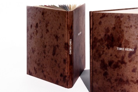
From there, Suuronen went directly to the source to finalize the project. The whole process was pretty informal and most of what I presented got approved straight away, from the structure and layout style to paper stocks,” Suuronen said. “For the cover I offered several options, and they chose the one which best fit Heino’s work—we made it into a curious object, a hard cover book complete with soft, squishy cover boards. Seriously, who makes a book to be like an egg?”
Upon publication, Suuronen’s eye-catching mixture of elegance and eccentricity quickly earned significant notice. The monograph was recognized as a Beautiful Book by the prestigious Finnish Book Art Committee’s annual Most Beautiful Books competition and also by the Finnish Art Society with an honorable mention in its Literature Awards category. The Book Art Committee described Suuronen’s work with particular enthusiasm: “What is this? Human skin, animal hide, marble? The cover of this book casts the reader straight into the physical nature of contemporary art: grab, squeeze, open. Anyone who dares to venture into this book is rewarded with a fine introduction to the artist´s works and a pleasant reading experience. The difference between the natural-yellow of the text pages and the chalk-white paper of the photo pages, the calm and well-paced layout and the modern typeface all deserve due thanks.”
Typical of Suuronen’s intuitive style, the book’s design itself reveal as great a depth of insight to the subject as the text and illustrations. “The book presents an experience similar to viewing Heino’s work in a museum setting, but with deeper insight into the artist’s philosophy and approach,” Suuronen said. “The text pages are printed in black only on uncoated cream-colored paper, while the projects are presented in full color on bright white, coated pages. The differences in paper stock not only create rhythm and pace into the flow of the book, but also make each section better functioning: the text sections are easier to read from the off-white, and the artworks are better reproduced on the coated paper. There’s also a few underlying narratives that run hidden throughout the book, should a reader really commit to the experience… there’s different levels in it.”
This is key to Suuronen’s constantly expanding international profile—her innate ability to enhance and elevate a project to the point where it assumes an even greater impact and significance for its audience. As the esteemed American designer Vanessa B. Dewey, formerly Mattel’s Lead in Creative and Development Experience and current LA Design Festival Board of Directors member, said, “I’ve been a fan of Laura’s work for some time—it is a fresh voice that stands out from current design. It possesses a refreshing elegance that catches your eye and pulls you in. While exploring, you’ll discover thoughtfully designed books with brilliantly sophisticated type to vibrant sculptural branding or poster design. Overall, it’s intelligent, simply brilliant design that’s never forced.”
The Los Angeles based Suuronen’s professional recognition steadily grows with each project, making her one of the most in-demand graphic designers anywhere—so much so that her current, very high-profile work load is subject to client mandated non-disclosure agreements. But, with her distinctive flair for arresting visuals, you’ll know it when you see it.
“I’d designed books and record covers before,” Suuronen said. “And these are the most permanent and culturally relevant mediums in the field of graphic design. I actually prefer making things that stand the test of time, as opposed to short lived, more commercial projects. I’m not interested in adding to the noise and clutter, but seek to create work that connects with people. I do love what we ended up with—I live for this stuff.”
