Tag Archives: Art

French Photographer & Director Chris Roman Brings Beauty into Focus

Director Chris Roman

In a world saturated with fleeting visuals and fast-paced media, the pursuit of true beauty feels more essential than ever. For some, beauty is merely surface level, but for director and photographer Chris Roman, it’s a way to communicate something deeper. Whether photographing fashion week or directing high-end campaigns for luxury brands like Dior, Chanel, Givenchy, Longchamp and Lancôme, Chris’s mission remains clear: to make the world more beautiful, one frame at a time.

“I like the elegance, the refinement and premium aspects of the luxury fields. Luxury brands tell stories, because they have a strong DNA and enriched history. I have much respect for them, I call them ‘Houses’ and not brands,” admits French photographer and director Chris Roman. “Their universe can vary but I’m always fascinated by their vision and I feel very lucky to be a bit part of it, to translate visually their vision and DNA.”

Shoot for Longchamp by Chris Roman

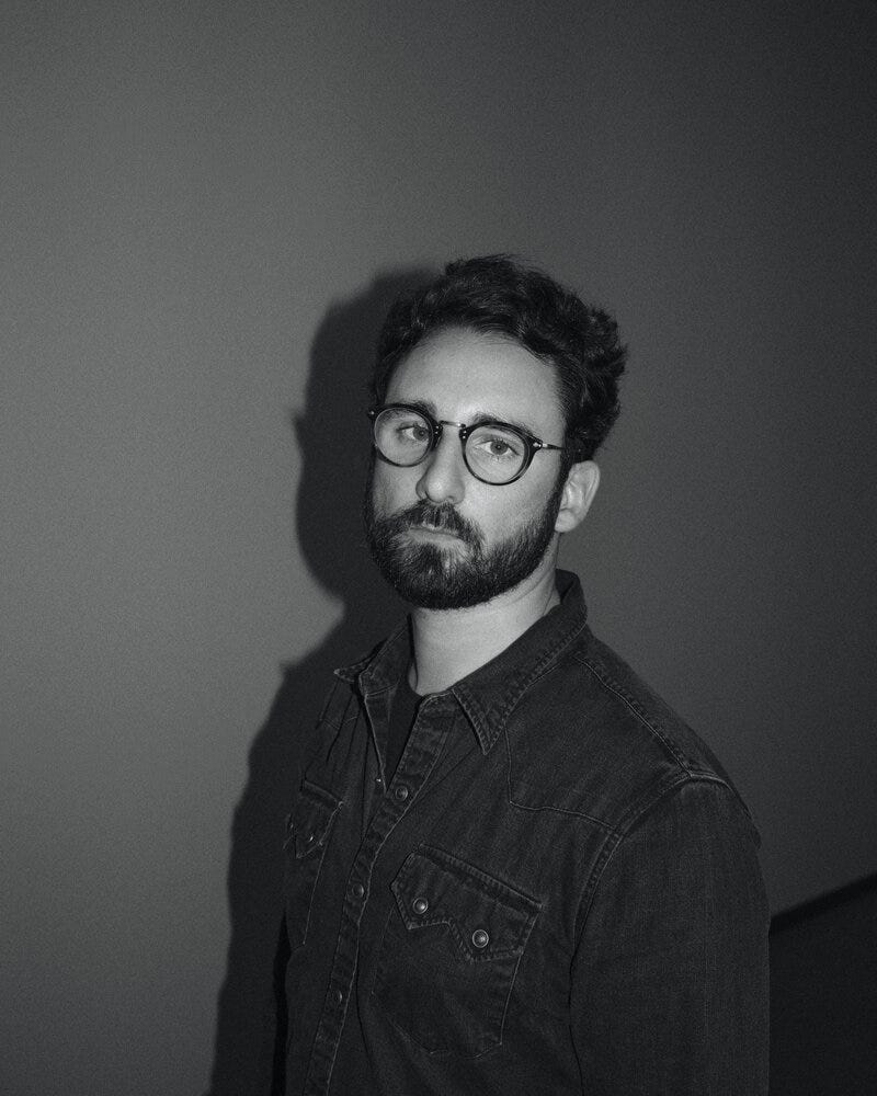
For Chris, beauty isn’t just a job — it’s a calling. As a photographer and director, hehas built a reputation in the world of fashion and luxury for his signature style that blends energy, emotion, and elegance.

His approach is deeply personal. “I call myself a beauty maker,” he says. “I do think we need more beauty in our world. Even if it’s through commercial work to sell beauty and luxury products, I tend to bring some beauty into people’s lives.”

From high-profile luxury campaigns and collaborations with Netflix and Vogue Paris to intimate behind-the-scenes moments at fashion weeks, Chris’s lens doesn’t just capture beauty — it creates it. His goal? To ensure everyone in front of the camera lives a memorable experience, capturing their truest selves with grace and style.

“I’ve been working with Chris since 2017 on many projects ranging from events video capture with filming high profile celebrities, creation of digital branded content campaigns and editing work,” explains Fanny Level, Chanel’s Head of Special Projects.

“He has an eye and sense of luxury aesthetic that few film directors possess…As a creative mind he’s dedicated to producing beautiful content in line with his client’s business brief… He’s extremely talented hence sought after by many luxury brands.”

Over the years, Chris has shot for some of the most iconic names in fashion, luxury, and entertainment where his reverence for each brand’s legacy shines through. “Every brand has its own DNA,” Chris explains. “My job is to respect that history while bringing my own creative perspective to the table.”

His work with Dior stands as a testament to this philosophy. Tasked with interpreting the brand’s timeless elegance, Chris fused traditional luxury with modern sensibility. In 2020 Chris directed a series of stunning videos titled “Dior Beauty Lessons” for Dior’s Capture Totale age-defying skin cream.

Chris directed five separate videos for territories ranging from France to Japan, which featured icons such as famous international chef Mimi Thorisson, Japanese model and actress Mayumi Sada, South Korean actress Lee Hanee, former model Rose Ferguson and actress Nina Dobrev.

“We proposed to create some beauty lessons in a very intimate environment to really feel the sincerity. Very organic and true,” explains Chris about the campaign.

With soft lighting and fluid movements there is a beautiful intimacy within each of the videos that makes us feel close to the subject, trusting that there is honesty within their words and a natural essence to their beauty– no doubt, Chris nailed the mark. His Beauty Lessons campaign for Dior exudes a quiet sophistication, with each shot capturing the essence of the brand’s heritage while introducing subtle contemporary flourishes.

Chris shares, “It’s about honoring the classic while leaving space for something fresh.”

His work for Lancôme follows a similar principle, bringing out the emotional allure of the brand’s identity. Whether showcasing their signature fragrances or beauty products, Chris’s visuals seamlessly blend energy and emotion into each frame.

For Lancôme’s Teint Idole Ultra Wear concealer, Chris directed a commercial campaign that was all about empowerment and unity within diversity, while maintaining the class of the brand.

“The client wanted an experienced director, who is used to shooting international celebrities with a high expertise in luxury and beauty,” recalls Chris. “The vision was to showcase all 15 women’s single personality while being able to bring them all together as one and empower them. Diversity was really important.”

Shooting in Barcelona, Spain with the set designer creating a little universe unique to each woman, Chris brilliantly brought them all together with Lancôme’s Teint Idole Ultra Wear concealer as the unifying force. Chris says his favorite part was “meeting all these incredible women from all over the world — women ranging in age from 20 to 65. Beauty has no age; my job is to enhance each one of them.”

With over 15 years of experience as a photographer and director in the fashion and luxury industries, Chris Roman has become known for a signature style that is defined by a unique blend of energy, emotion, and elegance. His ability to capture the essence of his subjects — whether it’s the unguarded emotion of a model backstage, the delicate balance of luxury and spontaneity or even the playful personalities of actors from a hit television series — has set him apart in the fashion and beauty world.

“Emotion is key. I’m here to help the talents to express themselves in a very organic and simple way. Never try too much,” admits Chris. “I always say, I feel like a conductor… I focus on making the talents comfortable while creating a bubble in between us to have them at ease and focused on the acting, like playing the right music which fits to the mood of the film.”

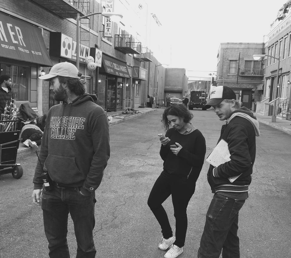
A prime example of Chris’s signature style can be seen in his collaboration with Netflix and Vogue Paris for the hit six-time Primetime Emmy nominated series “Emily in Paris” starring Lily Collins (“Tolkien”), Ashley Park (“Mean Girls”) and Philippine Leroy-Beaulieu (“The Crown”).

In both his commercial projects and personal endeavors, Chris creates art that resonates and elevates the brands he captures.

“Chris is a top-level advertising director. His creativity and professionalism make agencies and clients trust him with their projects to take them to the next level. He helps grow their stories to sell their products,” explains executive producer Carolina Legovich, who’s worked with Chris on a number of beauty campaigns in Spain.

With a passion for capturing moments that felt both authentic and artful, Chris Roman got his start in the industry after studying photography in Montpellier and Toulouse, France. He moved to London soon after where he managed a photo studio, prepping shoots and assisting photographers. This role allowed him to work with talented professionals from around the world, solidifying his technical skills and expanding his understanding of the fashion industry.

“After one year in London, I moved back to France and more specifically to Paris. I needed to be in the Fashion capital,” recalls Chris.

His big break came when he returned to Paris and started working as a production assistant for renowned photographers Garance Doré and The Sartorialist (Scott Schuman) during fashion weeks. It was during this time that Chris began experimenting with video. Bored with simply managing the technical aspects of shoots, he picked up a small video camera and filmed behind-the-scenes content. After editing the footage himself, Chris presented it to Garance, who was so impressed that she posted it online the next day. This spontaneous project marked the beginning of Chris’s career as a director.

Shortly after, he was called to New York by The Sartorialist to shoot behind-the-scenes videos for Vogue Italia. His talent for capturing the energy of fashion shows on film soon led to more opportunities, including a one-year stint traveling the world with Doré and Schuman, filming campaigns and fashion weeks for major brands. By 2011, Chris had made history by directing the very first fashion video content for Vogue Paris.

“I was shooting luxury events in Paris while I was working with Mario Testino. I first shot a GQ event, then a Vogue Paris event,” recalls Chris about what led him to shoot the first ever BTS videos for Vogue Paris.

“They just got their new website and they had never shot any content during fashion week, so I proposed that I go to NY and start to shoot some content during the shows, in the city and backstage.”

Featuring iconic brands and designers such as Tommy Hilfiger himself in NY to Mickael Kors, Burberry, Vivienne Westwood and Paul Smith in London, as well as Prada, Dolce & Gabbana, Fendi in Milan, Karl Legerfield and many more, Chris’s behind-the-scenes videos provided an exclusive, documentary-style glimpse into the world of high fashion, offering viewers access to moments previously unseen by the public.

Today, Chris Roman continues to create beauty through his lens, no matter the medium. Whether directing high-profile campaigns for luxury brands like Dior, Chanel and Lancôme or capturing the energy of famous actors for series like “Emily in Paris,” Chris’s work resonates on a deeper level with audiences around the world.

As he looks to the future, Chris is focused on expanding both his photographic and directorial portfolios as he continually pushes the boundaries of what it means to capture beauty. His unique approach — one that blends technical precision with raw emotion — has left an indelible mark on the fashion industry. For Chris, the key to success lies in his ability to create genuine connections with his subjects and collaborators, a skill that continues to drive his creative vision.

In an industry where visuals are constantly changing, Chris Roman’s work stands out for its timelessness. His images are more than just beautiful; they are imbued with emotion and energy that make them feel alive, ensuring his legacy will endure in the ever-evolving world of beauty, fashion and more global luxury.

Art Director Phenix Miao helps raise thousands for Itron Battery Crowdfunding

Not many children can grasp the understanding of color and architecture the way China’s Phenix Miao could. At a young age, he was quickly able to spot the small details in furniture and props in daily life. It was a hobby and skill that he quickly realized could transition into a career. Working as a successful Production Designer and Art Director, Miao is now a leader of the industry in China.

Throughout his career, Miao has shown what a dynamic Art Director he is. With his work on films such as Shanghai Sojourner and Lottery, Miao’s attention to detail and vast talent is evident. He also lends his skills to commercial work, recently creating a series of promotional videos for Lepow and another for Itron Battery to promote their crowdfunding. With an outstanding number of viewers online, the Itron Battery commercial is one of his greatest successes in his esteemed career.

“Phenix is a very rare talent with both marketing and artistic sense. We worked closely on the Itron commercial, talking a lot about budget and production. Phenix was vital for the success of the commercial, and even found the location at a very affordable price, which helped the feeling of the film. He helped me to balance the art and budget so well. He is an expert when controlling the costs of everything. Phenix understands the difference between marketing value and artistic value, and he understands people. From his angle and visual aspect, he did a great job making the crowdfunding video look appealing. A crowdfunding commercial should be tangible and amiable, not chasing perfect as a normal TV commercial would. Phenix told me that crowdfunding is not charity, you need to let people feel this is a hopeful product and company. This outlook inspired the team. His outstanding communication skills allowed everyone to clearly understand what we were doing. He is a great leader and creator,” said Alice Fan, Producer.

The Itron Battery commercial advertises the company’s portable battery bank, the world’s fastest portable charger. It completely charges in 18 minutes, and within three minutes, one phone can be charged. The commercial showcases the product while still being comical and informative. It features two leading characters, one explaining the charger, and another looking to purchase one. They run through many different scenarios in which one may need a charger, leaving viewers both entertained and in need of the product.

“All the people that worked on this commercial were so professional. We did our work really fast, because we were so familiar with each other. From scene to scene, people just did everything very naturally. There was such chemistry, everything was as natural as breathing,” said Miao.

This commercial was not Miao’s first experience with a crowdfunding style video. He previously helped to raise $217,501 USD for Pivot Turingsense crowdfunding, achieving 274% of their goal, and for HiSmart crowdfunding, they reached 531% funded after raising $297,106, with the videos being the main source of awareness. That being said, the Itron commercial was by far the most successful, with hundreds of thousands of views online and reaching 706% of their goal by raising $289,472. It was also an Official Selection at the 2016 International Peace & Film Festival in Orlando, Florida.

“I still feel really excited about this commercial. When I hear so many people talk about it, I almost want to run up and interrupt them to let them know that I worked on it. That’s how proud of it I am. It is a big success in three aspects: art, commercial and crowdfunding,” he said.

Miao and the Director of the shoot, Peter “Zhen” Pan, had known each other for ten years when the opportunity to work on the commercial arrived. Miao is the director’s go-to art director and was the first person he reached out to. After reading the script, Miao accepted right away.

“Peter and I are golden partners. He knows I am a great Art Director that is full of ideas and the perfect match for what he wants. He just called me and told me the details about this project and we started working on it that same night. He always gives me enough space and time to design and develop my ideas. He fully respects me,” said Miao.

As the Art Director, Miao was in charge of the overall look for the commercial, selecting the best and most suitable artistic elements while leading the creative team. He designed a concise, natural, and clean aesthetic while controlling the style. He understands the difference between market value and artistic value, setting him apart from his colleagues. For this Itron commercial, he designed the color tone with Pan and knew to keep in mind the difference between a regular commercial and a crowdfunding commercial. He made sure to meet the requirements while planning the artistic elements around the brand, creating a higher brand value for the video. This allowed the product to stick in customers’ minds.

What was perhaps Miao’s most considerable contribution to the commercial, however, was finding the location of Elliston Winery. Miao enjoys working in historical settings, and the winery is no different. When decorating a historical set, Miao plays with the flavor that they bring to the table and plans everything around the atmosphere they possess. His passion for the location was passed onto the entire cast and crew. They treated it like their homes, making sure to respect every piece of furniture and brick in the building. Such respect for his setting and its parts is a main reason Miao is such a formidable artist and leader.

“I have been Phenix’s Assistant for years, but I also see him as my guide in my film career. He is not only in charge of the art department but is also a tremendous team leader. He understands style and perfectly controls the appearance of every image. Phenix is a great mentor and teaches me all of his techniques and knowledge. He is a talent but also very easy going. Phenix always knows how to take a director’s idea and turn it into something special. He knows how to make the effects suitable and always has new, practical ideas that come from his plethora of experience. I think the fact that he has also worked as a director and writer allow him to understand the role of the art director even better, and it sets him apart from the rest,” said Qin Zheng.

Watch the Itron Crowdfunding commercial here.


Photo taken by Peak City International Film Festival, Phenix Miao and John Whitaker

By Sean Desouza

Production Designer Laura Santoyo talks new film ‘Falling’

Learning about various aspects of humanity is a passion of Colombia’s Laura Santoyo Dangond. Originally from Colombia, she has also lived in Peru and Canada, and loves to travel to experience different cultures and learn new languages, fluent in Spanish, English, French, German, and Portuguese. This desire to learn about the world and its people is part of what led her into filmmaking. With every new project she embarks on, she gets to tell a different story and learn something new about history, society, the human mind, and more. Beyond the stories, she works with people from all over the world that have different backgrounds and ways of seeing life, and together they share and experience their differences through their art. As a production designer, Santoyo takes everything she has seen and practiced and channels that into creating visually stunning and captivating sets and props that fully transport audiences into what they are watching.

“I make an effort to stay true to the story and what the characters are. I do a lot of research on the characters and the environment where they live. I also try to have many exchanges with the director where we discuss characters and share research and inspiration images, etc. to understand their vision and the direction they are taking the story to. I like to play with colors and used them to imply aspects of the story that are not explicitly spoken by the characters,” she said.

Santoyo is known for her work on award-winning films such as Lockdown and Tim of the Jungle, both of which made their way to several of the world’s most prestigious film festivals. Last year, her film The Plague premiered, reminding audiences of what she is capable of, as Santoyo created a dystopian world. Her most recent film premiered just last month at the Slamdance Festival, and once again Santoyo shows she is unrivaled as a production designer.

Falling set_2
Bill Bowles, Laura Santoyo Dangond and Ewen Wright on the set of Falling, photo by Sam Shaib

“As soon as I finished reading the script I felt like I had to be part of the project. It is one of the most original scripts I have read, very intelligent and I thought that it was a story that had to be told and that I wanted to tell it,” she said. “The script of this film describes a number of absurd situations and uses humor to address subjects that are affecting our society. It was very important that the design of the movie supported the comedic tone without ridiculing the situations.”

The film tells the story of a potentially psychosomatic white man, a woman stuck in a vortex of mansplaining, and a young black man confronted by the racial disconnect of society, each trying to make sense of their lives as their worlds are set on an inevitable collision course in this surrealist comedy.

It was important for Santoyo and the rest of the team to differentiate the three storylines that run parallel to each other and to show the absurdity of the situations without being too over the top. Therefore, they assigned one color to each character.

The first story, about a man who can’t walk, represents the feeling of impotence that someone watching the news at night can feel when they see injustices with no way to help. This character takes the “sickness” he feels to the extreme. Therefore, they decided to use the color blue with him, which is very clinical.

The second story, about a woman who’s caught in male-dominated conversations turmoil, was assigned the color red. She is often angry and frustrated, and all the men that she’s with see her and other women as objects. Santoyo felt red reflected these feelings.

The third story is about a black man, who in the most absurd situation, ends up being shot by the police. The filmmakers gave him the color green, because he’s young and innocent at the beginning and at the end it is his case that makes the man in the first story sick.

“As a society, we are still fighting against racism, social injustice and women’s equality and this film raises awareness on these subjects in a comedic tone. I believe that it is very important to have films like this one because we can start generating discussions that could eventually lead to change,” said Santoyo.

Working on Falling has been one of the most fun experiences Santoyo has had throughout her career. From the first time she read the script, she knew it was going to be challenging because there were many locations with three different stories that at the end become one. Each story had elements of magical realism that could also be difficult to achieve in production design. Santoyo wanted to enhance the experiences of the character through the set, but not overdo it to a point that the messages behind each scene were lost. She managed to find the perfect balance, always keeping in mind the color palette they had decided for each character early on in production.

“I think many things make Laura an excellent designer, collaborator, and professional. The first thing that comes to mind is passion. She’s clearly passionate about what she does – she made it clear that she seeks out work that she connects with on a personal and aesthetic level. Once she’s onboard, she’s obviously all-in. That shows at every phase of a project when you see her initial ideas, the hours she’s putting in, the attitude she brings to every meeting and production day, and the diligence with which she executes. Beyond that, she’s a professional with outstanding training, instincts, and experience. She knows how to present her ideas clearly – both verbally and visually, she has leadership skills, she remains calm under pressure, she knows how to prioritize, stay organized, and keep others motivated to work at a high standard,” said Ewen Wright, Director.

Wright was looking through portfolios and films for a costume designer when Santoyo’s work caught his eye. He asked the costume designer who the production designer was that possessed such talent. He immediately reached out to Santoyo, who was extremely responsive and receptive to the idea of the film. They immediately began a strong partnership and shared ideas about the film.

Falling Set
Ewen Wright, Laura Santoyo Dangond and Yonit Olsen, photo by Sam Shaib

“Laura has a creative voice, and in a key role on a collaboration that can’t be undervalued. She brings her lifelong sense of design, studied theory, and just pure instinct to her work in a way that gives her work a through-line. I really enjoyed developing a shorthand with her. Lastly, she has a phenomenal attitude and work ethic. She went above and beyond for our production – and even when things went wrong, or the hours ran long, Laura was a reliable source of positivity and joy. As a leader on the team, she set a tone for those around her that I know contributed to all of us doing better. When I was stressed or needed a moment, I always knew I could rely on Laura for a laugh – just as the rest of the time I relied on her for her eye on the image,” Wright continued.

Working with such a committed team was one of Santoyo’s favorite parts about filming Falling. She found everyone came together to tell such an intricate story, and she was constantly inspired by those she worked alongside. However, it was the message behind the film that truly made the experience for the production designer.

“I am so proud to have been a part of this film. I think it’s a story that captures the feeling that something is wrong in the world and the willingness to change it, but not knowing how to go about doing so. I think many people feel that now. I’m thrilled to know that it’s being watched by many people and it can maybe inspire some change in our society,” she said.

Now that Falling has begun its film festival run, Santoyo is looking forward to her next project. Undoubtedly, she has a very bright future ahead of her, and audiences can continue to look for her name rolling past their eyes in movie credits for years to come.

“I want to keep exploring and finding new stories to tell and more talented people to work with. I am looking forward to creating more worlds where magic is possible. I want my work to reach even larger audiences and present stories to the public that entertain them and that touches them. I have a couple of projects in line for this year that hopefully will help me accomplish this,” she concluded.


Top photo by Jesper Duelund

Tooba Rezaei experiences the magic of touching hearts through ‘A Sweet Dream’

A-sweet-dream-poster-small
A Sweet Dream film poster

One of the most unique joys of being an artist is knowing that your work evokes raw, human emotions within those around you. Visual arts have the ability to transcend the mundane aspects of human life and to push people to explore themselves and the world around them. Over time, art has created change. It has inspired and influenced. It has created chaos and disruption, and it has birthed a community of dreamers, and creators. It has produced renowned artists like Tooba Rezaei, whose passion has allowed her to touch the lives of several different people throughout her career. For Rezaei, the true joy of her craft comes from the platform it gives her to make people feel things that they may not otherwise have the chance to feel. She gets to tell stories and to motivate her audiences to dream without limits.

When Rezaei was a child, she would immerse herself in cartoon television shows. When each show ended, she would take her pen and paper and challenge herself to draw all of her favorite characters. She was energized by the feeling of her pencils exploring the paper and loved the creating things that hadn’t otherwise existed. As she grew up, she continued to test her skills against various mediums and art forms within the field of visual arts. This led her to discover the wonderful world of animation, a world in which she feels that she belongs. She has a natural affinity for bringing her drawings to life via animation and loves the dynamics that the motion brings to her artwork. As an animator, Rezaei has created a number of well-known animations, such as her original animation, A Sweet Dream. Prior to creating A Sweet Dream, however, Rezaei experienced her first sense of impacting the lives of others through her artwork with her animations for the game SilverFit.

SilverFit was a game designed specifically for use by an older demographic. Essentially, it is a virtual therapy system to be used to train gross motor skills and ADL tasks during rehabilitation sessions. The game presents the necessary exercises for elderly individuals to follow along with and keep their muscles working accordingly. Since its inception, the game received great success and is now used by over 20,000 individuals a week. As SilverFit’s first designer, Rezaei acted as the background designer, background painter, character designer, and character animator. She designed a wide variety of different games, each based on the use of different motor skills to suit the game’s intended audience. In working for SilverFit, Rezaei got a taste of what it felt like to know that her work would directly aid in helping improve the health of its target audience. It gave Rezaei’s art a meaningful sense of purpose and she was addicted to the high of helping those around her. SilverFit’s founder and managing director, Maaike Dekkers-Duijts, was blessed to have Rezaei on board for the project. Her talents exceeded far beyond simply animating.

“Her animations really seem to come alive. They really ‘touch’ you. She is a great artist, creating extraordinarily beautiful animations. She is so artistic and has exceptional talent,” regarded Dekkers-Duijts.

After the success of Silverfit, Rezaei then extended her talents to the children’s show Parparook for Persian Gulf TV. Parparook (meaning ‘Pinwheel’ in the South of Iran) is a special program that is produced and distributed in Kahlije Fars IRIB (Islamis Repablic of Iran Broadcasting, also known as Persian Gulf). Rezaei wrote, directed, designed, painted and animated all the characters and all the objects on the background of Parparook, creating everything from scratch and differentiating her shorts from everything on the show. The producer and manager of the program were so happy with results that years later they used some of Rezaei’s work for other kid’s television programs as well.

Knowing that she had always wanted to create her own animated story, she knew that in order for it to be truly worth her while, she would need to give it an element of social influence. She wanted to do more than just entertain, and out of this determination, A Sweet Dream was born. A Sweet Dream can be described as a bittersweet, allegorical look at the desires of a little girl who wants the world to see her talents shine through her difficult life circumstances. Not only did Rezaei animate this project from start to finish, she also wrote and directed the storyline. To fit with the animated short’s premise, Rezaei felt it fitting to use a simple, two dimensional, flat design. In fact, she felt that the simplicity of the drawings was imperative to the overall mood she was attempting to portray. She wanted it to seem as if the little girl could’ve drawn the lines and shapes herself, making her world easier to relate to for her audience. Rezaei then added a second element to her design concept by showcasing the little girl’s reality through dark blue tones and contrasting it with her dream state, which Rezaei colored in golden tones.

“In her dream world, forms are curvaceous and delicate. There is dance and movement and inspiration. However, in reality, she is in an orphanage and the forms of the beds and the room are sharp and straight with harsh angles, alluding to her real-life struggles and difficulties,” said Rezaei.

Rezaei hoped that A Sweet Dream would challenge her audience to question their own harsh realities and evaluate them against their own hopes and dreams. She wanted them to think about how they would react if they were in the little girl’s shoes. Would their dreams be squandered by their reality? According to Rezaei, if we don’t push ourselves to understand the lives of others, we can never truly improve our society as a whole and make our collective world a better place. She felt as though A Sweet Dream helped to remind her why she does the work that she does. Seeing her audiences shed tears over her story solidified the reality that this is exactly what she wants to be doing and that she had succeeded in her efforts to make them stop and think about the consequences of their actions.

After screening at a number of different film festivals, A Sweet Dream even went on to win Best Animation at the Los Angeles CineFest, as well as Finalist in Animation Short at both the International Film Awards in Berlin, Germany, as well as at Constatine’s Gold Coin Festival in Serbia. If you wish to experience the magic, watch A Sweet Dream for yourself and you won’t be disappointed.


Image by Tooba Rezaei, captured from ‘A Sweet Dream’

Art Director Hanna Petersson brings unique touch to packaging

Hanna Petersson is not like other art directors. She is constantly adapting, looking for a new challenge with each new day. Her style is influenced by her Swedish heritage. Scandinavian design is very scaled back, simplistic and focuses on form and function together rather than just putting things into a design solely as decoration. For Petersson, each part of a design must have a purpose, and if it does not, she knows exactly how to give it one. That is what makes her such an outstanding talent, and why she is known internationally for what she does.

At just 23, Petersson has put her artistic touch on some of the world’s largest brands. She has collaborated with many teams, creating imagery and customer engagement for Samsung, Swedish Match, and more. Her artwork captivates, and her individual exhibition at the House of Culture in central Stockholm garnered a lot of attention and earned her quite the fan base. She uses illustrations to tell a story, and uses her talent to help many brands increase sales.

“As an art director, it is incredibly important to research the client and the target audience and to create content based off of this that is rooted in facts and human truths. A design can look amazing, but unless that design is perfectly suited to the client and target audience the design is useless. What I need to make sure is that I always do my homework on whatever project I may work on, that I am passionate about it, and that I make sure that every detail is perfect before going into the physical production of the idea. The art director comes up with an idea and is in charge of directing it all the way from idea to finalized product. It is a great responsibility and a big challenge, but also incredibly rewarding and interesting to work on,” Petersson described.

Having worked with reputable retail agencies like WorkShop and Grey, Petersson also recently worked with AdPlant. With the company, she worked on a variety of projects to create visual development and branding for big companies, which will be released next year.  Although the official projects can’t be mentioned for this reason, Petersson’s work with the company astounded all she worked with.

“Hanna is an excellent creative talent. I’ve had the pleasure of working with Hanna as both an illustrator and a communication creative for AdPlant network. She is a quick, smart person who pays attention to details in her handicraft. She is a warm and kind person who will ‘run that extra mile’ to deliver pitch perfect creative work,” said Marcus Enström, Founder of AdPlant and Lead Creative.

Petersson’s work greatly impressed AdPlant’s client. Despite not yet being released, the project she worked on has already had a lot of success, and the client is looking to have similar projects follow this one. They know it will be a hit, and they want to work with Petersson and AdPlant again after such a successful collaboration. The product category is one of the most sold in Sweden, and the designs Petersson has produced are one of a kind. They will undoubtedly increase sales and attract new customers to try the product. Petersson knew exactly how to please the company and potential customers at the same time, which is quite the challenge for many art directors.

To do this, she first had to identify exactly what was needed. In this case, it was a series of packaging designs with a unique set of illustrations that she would produce. She then needed to create a new set of color combinations to be used that would not only communicate the right feeling, but also easily convey what the product is and what it stands for. According to Petersson, designing a series of new products within the same category means that they must all be similar to each other and feel like a series, but they need to stand out from each other and be the most unique at the same time. Finding that balance takes some time and a lot of work goes into just coming up with an extraordinary amount of different variations and suggestions that then will be used to decide exactly what the finished product should look like. The process took Petersson quite a long time, because the client wanted to make sure that they were a part of the process every step of the way and got their say in the final product. As Petersson is known for her excellent communication skills, this was not a problem, and she knew exactly what they wanted before they even had to say it.

“This was a blast to work on because I really got to improve a design style I had dipped my toes in not too long before. What was also great was that I knew that these designs would be seen by hundreds of thousands of people in their everyday lives and that my work would be one of the main reasons for the success of the products,” said Petersson.

After seeing Petersson’s previous designs, Enström approached the art director knowing she would be a necessity for the success of his upcoming project. Petersson had previously done a project where she designed and sold apparel through her own shop. These designs were unique, and the founder of AdPlant later found the project in an online shop and asked her if she was interested in working on a project using a similar style of design. Despite working on other projects at the time, Petersson said yes to AdPlant. She was immediately interested in working on the project when she heard about it, and wanted to work on a packaging design project that would be a vital part in the sales of a company. She knew she would be able to influence what the design of the product category could look like and innovate the category from what it was at the time.

“It was very nice to hear that a company was interested in my designs and talents and therefore I was very happy to work on the project from the start since I knew that they wanted me specifically and therefore trusted my opinions, which let me have more freedom in my work and to really push the designs further,” said Petersson. “That I got this responsibility was a great honor and it really allowed me to trust more in myself and my skills. Not only was this a great project from an art perspective, but also from a work experience perspective as I got to communicate with a very large, international company and that they got to see my work directly,” she concluded.

Petersson’s advertising experience and her natural artistic talents make her the perfect art director. She will undoubtedly continue bringing success to anything she works on, and is definitely one to watch.

Graphic Designer Suzy van der Velden beautifully captured surf lifestyle for O’Neill

7L5A5378_f1
Designer Suzy van der Velden

Suzy van der Velden was just six years old when her father made her first desk. It was then when her creativity awoke. She could sit at her desk and spend the day drawing whatever came to her. She still does this today, however, it is often for some of the world’s biggest brands.

Van der Velden has quickly become one of the best Dutch graphic designers. She has established herself through her impressive work with Lululemon, Oilily, and more. When working with the internationally successful sporting wear brand O’Neill, van der Velden once again showed the world what she was capable of.

“I wanted to be part of O’Neill because it’s a brand with a rich heritage. Not a lot of brands have a real story, but O’Neill does and it’s a great one. Rooted in surf, it’s founder Jack O’Neill has changed and touched the lives of many by inventing the wetsuit. That mindset of innovation and to see how we can enjoy nature for longer is something that really attracted me to the brand. As an outdoor enthusiast, I love spending time exploring nature and to be part of a brand that views nature as a playground is an amazing thing,” said van der Velden.

While with O’Neill, van der Velden was responsible for all artwork for the Women’s & Girls collection, including swim wear, snow jackets, lifestyle, outerwear and collaborations such as Liberty London. With such a vast range of work, she researched the different categories extensively, looking to find what the best print techniques were, what was suitable for them, and how to push the limits to innovate and what the trends were. With a shift towards craftsmanship in the company, van der Velden was then free to use her creative freedom, producing the high-quality artwork she is known for, which was more expressive and pushed the brand forward. She worked to create an image for each specific product, as well as the brand as a whole.

“For Swim, I would design in a different way than for a Snow jacket so to say. This could have to do with scale, but also the esthetic would differ and use of color. This made the role interesting and never dull. I became a specialist in knowing what was the best way to approach all the different categories,” she described.

Van der Velden’s passion for the brand was evident in each piece of work she produced. She designs with the end customer in the back of her mind, and at O’Neill she gained a strong understanding of the action sport industry and the lifestyle that goes with it. The energy of the board sports, she says, is reflected in the collections, making it a really diverse and fun environment to be in. Van der Velden also travelled frequently for work, and she really got to see how the brand was appreciated beyond just the walls of her office. She immediately noticed the team spirit from those that wear it.

“I loved the fact that the product I worked on gave people the opportunity to enjoy what they loved most. My greatest reward was being able to see my designs come to life and seeing people wear my clothes in all areas around the world,” she said.

It wasn’t just customers that were impressed with what van der Velden produced. She was able to take trends and translate them into her work in a way that made sense for the brand, greatly contributing to its success. She consistently hit the right tone for each specific product, and her artistic instincts were greatly appreciated by all she worked with.

“It was great working with Suzy and I personally really enjoyed it. She was very well respected by the entire team and had an easy yet professional nature. I found that Suzy could bring a graphic story and direction across with natural authenticity and could get people to buy into the big picture with her simple but very educated communication style,” said David Henry, the Global Snow Performance Product Manager and European Accessories Product Manager at O’Neill. “Three words spring to mind when I think of Suzy: easy going, knowledgeable, and professional. Suzy was always on top of things and this gave me confidence that we were on the right track. She was also always open to others point of view and the resulted in meetings that were well balanced. Suzy always brought a sense of calm with sometimes big egos and I really liked that about her.”

Initially, van der Velden wanted to work at O’Neill for the experience, but it quickly became much more than that. As soon as she started working at O’Neill, she knew she wanted to stay a part of the team of young talented individuals with a passion for action sports. Although it was initially a temporary position, van der Velden’s work ethic and talent quickly impressed, and she was offered a permanent spot not long after.

Van der Velden also was inspired by the story of the founder, Jack O’Neill, who invented the wetsuit. This allowed people to surf in all areas of the world that were never able to otherwise. The goal of the company is to ensure people can surf no matter the water temperature. Their mission is ‘to surf longer’. O’Neill is known for its extraordinary athletes that are always pushing the boundaries, causing people to always be engaged to what the brand is going to do next. Van der Velden’s designs captured those ideals perfectly.

“Innovation is in the brands DNA and this makes sure O’Neill is ahead of the game, plus there is always an element of fun keeping it light,” said van der Velden.

The six years van der Velden spent at O’Neill, were in her words, a “blast.” However, it was always the inspiring story of Jack O’Neill that appealed to her, which she describes as timeless.

“Jack O’Neill passed away on the second of June of this year. It’s sad to see such a legend pass away, but I’m grateful for what he has built and that I’ve been able to be a part of the experience in a way,” she concluded.